
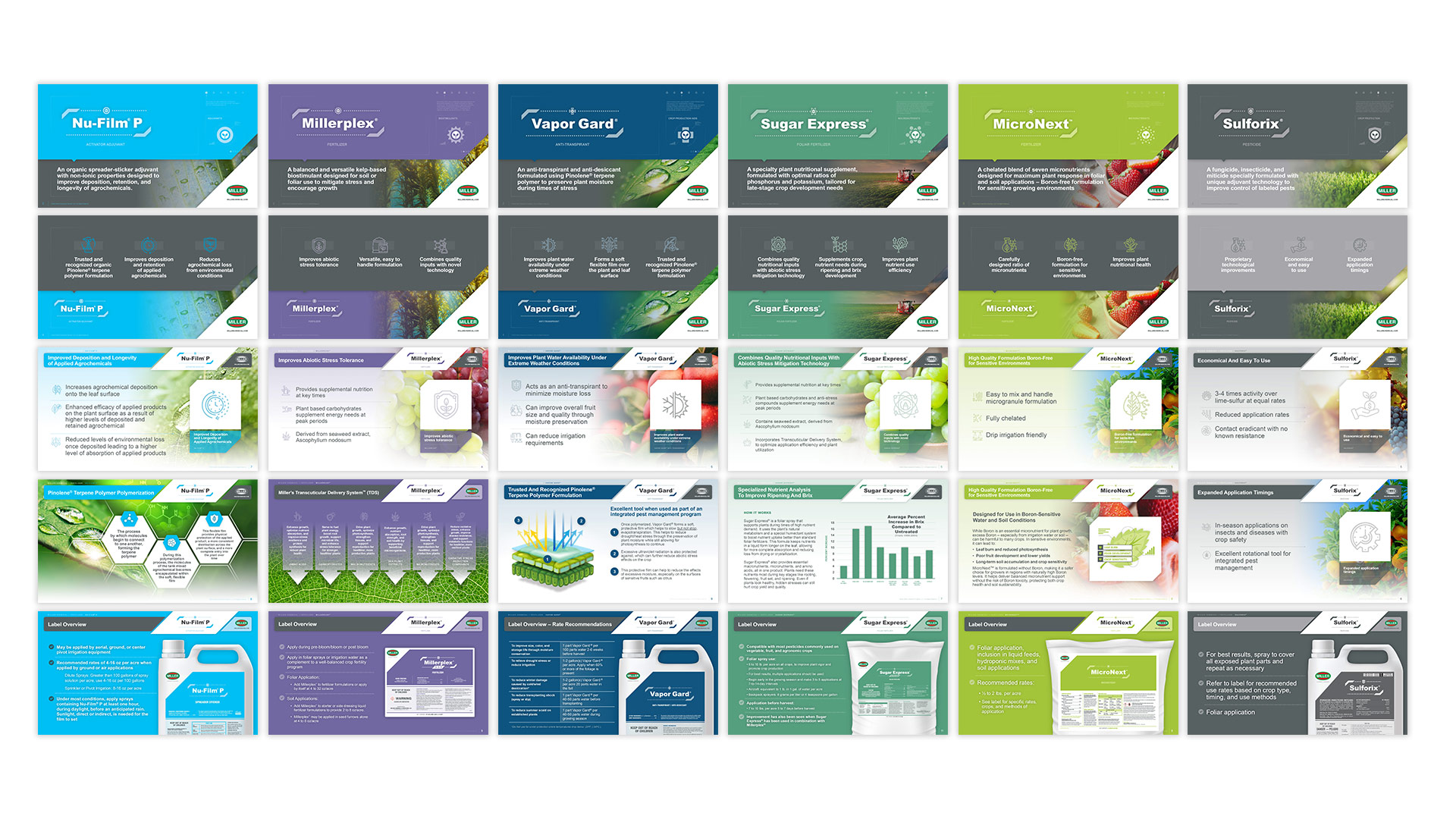
design of powerpoint templates for the complete family of product categories for miller chemical
CrossEye, Inc was given the opportunity to design and produce new PowerPoint templates for the six categories of products produced by Miller Chemical. This exciting challenge entailed taking existing PowerPoint presentations created internally over many years and reorganizing the information as well as redesigning the overall template, graphics and charts for a select group of products. Each of the six templates consisted of ten different dedicated master slides that we used to create over 50 new product PowerPoint presentations with more being created each month. Through the process, we learned Powerpoint is capable of being a much more powerful tool for any brand!
redesign of a multi-product brochure for huber specialty minerals
CrossEye, Inc. was given the opportunity to reimagine the 8-page brochure featuring the product HuberCal for Huber Specialty Minerals. The challenge in this piece was...
designed, animated and coded the 2026 winter jam tour website
CrossEye, Inc. provided design, video and programming/development assistance to the 2026 Winter Jam tour - an annual tour that visits 40 cities across the eastern...
designed a new go-to-market brand look for huber agrosolution owned companies
CrossEye, Inc was given the opportunity to offer new go-to-market branding design solutions for the materials of Italian-based, Huber AgroSolutions owned companies of Biolchim, Cifo...
design and development of a fully customized online conference management system
CrossEye, Inc was hired to plan, design, code and implement a fully customized conference management system that can manage an unlimited amount of simultaneous conferences...
re-designed the go-to-market brand look and feel for miller chemical and fertilizer
CrossEye, Inc was given the opportunity to re-design the go-to-market brand look and feel for Miller Chemical and Fertilizer, a Huber AgroSolutions owned company based...
fire retardant materials complete product family logo re-design
CrossEye, Inc was asked to design and develop a new product logo solution for Huber Specialty Minerals entire line of fire retardant materials. This line...